Triptrop NYC: heatmaps heating up

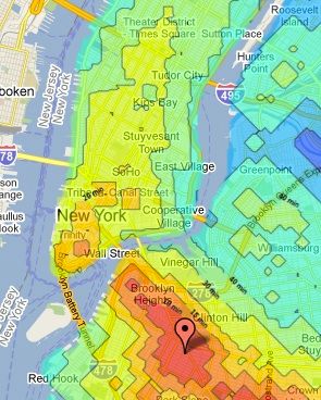
I’ve been looking for a tool to generate a heatmap of transit times from any point in Manhattan, and just discovered the awesome triptrop NYC.
For any address in New York, it displays a map of transit times to the rest of the city. Very useful for sussing out potential places to live. It even has a feature to compare two maps side by side. Check it out!
It looks like the author has done a lot of work just to get this running Maybe they will do a bit more work and consider building a few more features or releasing an API for this so anyone can build off of it. My big feature requests:
1. Enter two addresses and get a single heatmap showing which is closer to all locations. Green areas mean one address is closer, red areas mean the other address is closer. Lighter areas mean less of a difference.
2. Enter multiple addresses with weights (for example, work and friends’ addresses, with a frequency per week they are visited) and create a map of best places to live based on a weighted average of transit times to those places.
3. A clearer color scheme.